Home | About Me | CSCI Work | Personal Work | Contact Info | Helpful Links |
In-Design Projects
Compact Disk
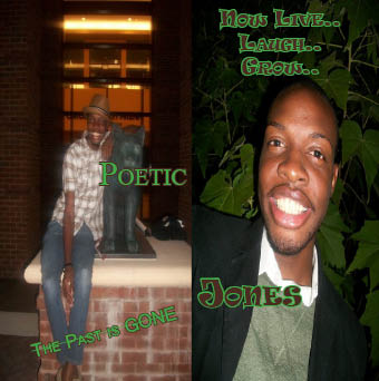
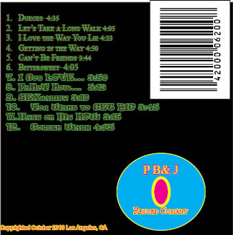
On the front cover, I decided to have two photos of the artist to create that “Then and Now” feel to it. The title of the album and titles that separate the tracks on the album were chosen to describe the artist’s feeling.
On the back cover, I choose to do black as the background to bring emphasis to the rest of the information place on the back. As far as text, I used Times New Roman with a strike-through to represent songs from the side the “Past is Gone” and I used Ravie font to show songs from the “Now Live..Laugh..and Grow side of the album. For my record company, I used my initials as the record company name to personalize my cd cover from other
Post Card
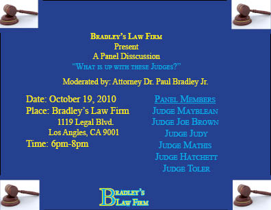
For my event, I decided to do a panel discussion called “What’s up with these Judges” because I want to create an opportunity for my clients and potential clients to ask an judge that they normal would not be ask while they are in court with them.
On this event card, I included who the moderator was, the panel member and specified the date, time, and exact location by given an address. In addition, I chose these panels members because I consider these judges to be the “hot topics of the courtroom” with them being on television. As far as color, I chose colors that would jump right off the page and catch the eyes of the reader.
Flyer
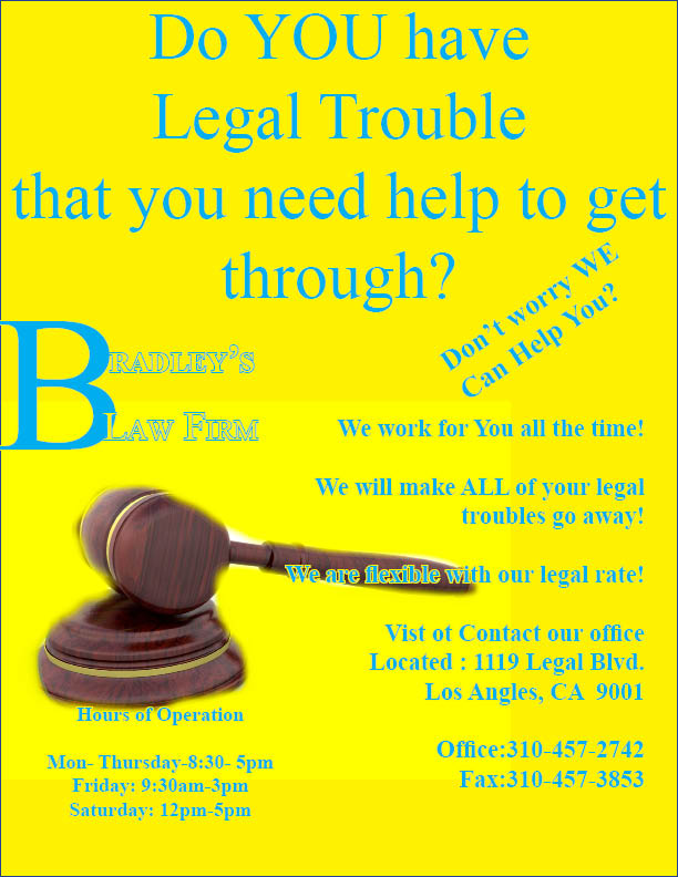
I choose to have question posted at the top of my flyer to make readers curious to read more. Then I chose a bright color like yellow for the background and light blue for the text to draw the audience attention to the flyer by making the words jump off the page at them. In addition, I also played with the text attributes such as small caps to create distinction of a important part of the text.